
Too many panels problem in Firebug
by Honza- Published:January 7th, 2010
- Comments:27 Comments
- Category:Firebug, Planet Mozilla
I have already mentioned several times that the number of extensions for Firebug is unbelievable and still increasing. My guess is that there is currently about 40 extensions adding new features. And of course, this great to see!
Many of these extensions are creating new panels with various additional info, often related to the current web-page and the problem is that there is not enough horizontal space to display all the panel tabs at once. So, after installing enough number of extensions, the situation can look like as follows.
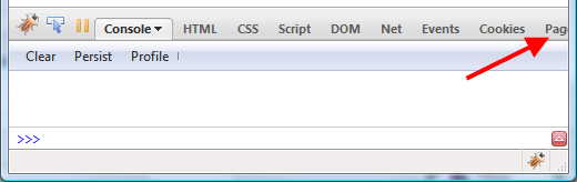
The screenshot clearly shows what happens if there is too many tabs. The search box is pushed off the screen and it's not possible to even see the other tabs...
Please help us to decide how to solve this problem!
Shrink Tab Size
One solution could be to shrink tabs so they don't take so much horizontal space. Similar solution is used in Chrome browser:
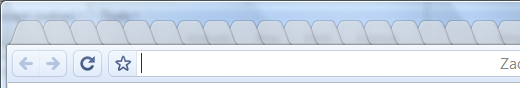
Firebug UI would look like as follows in this case.
Note that I am using extremely small browser window (520px wide) for all screenshots so, they show the problem and also fit the size of this blog. In real there is usually more horizontal space.
Advantages:
- The user doesn't have to deal with scrolling.
Disadvantages:
- In case of larger number of panels, this solution doesn't have to be enough.
- It's harder to deal with tabs since there is no space to display labels.
Anyway, the little drop down arrow next to the panel tab list is intended to display entire list of available panels (similar to what Firefox does for tabs).
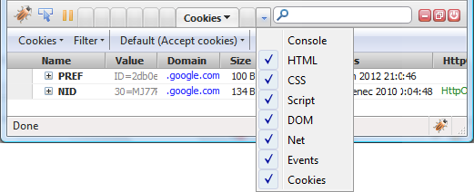
This menu should allow to manage visibility of individual panels and/or help to quickly switch to another panel.
Scrollable Tab-bar
Other option could be to make the tab-bar (the area where all panel tabs are displayed) scrollable.
The tab-bar area is enclosed by scrolling buttons that appear only if necessary (i.e. in case there is no space for displaying all tabs).
Advantages:
- This solution solves any number of panels.
- Labels visible.
Disadvantages:
- The user has to deal with scrolling. This can be annoying if often switching between the first and last panel.
Slightly modified version of the above.
What do you think, what would be better for your experience?
Do you have any other ideas how to solve this issue?
I appreciate any tips/comments/proposals!


27 Comments
[...] Software is hard | Too many panels problem in Firebug http://www.softwareishard.com/blog/firebug/too-many-panels-problem-in-firebug – view page – cached More musings on software development [...]
Why not simply take your scroll solution and eliminate the disadvantages by allowing users to re-order the tabs by dragging them like they would in Firefox.
if they're becoming annoyed with scrolling between the first and last panel, just drag the last panel up to the front and voila, they're side by side.
I like the Chrome-type option the best out of your examples, but another thought I had was to do something like Spaces does for OSX 10.5. It will still only show a finite amount of tabs, but you could have different "screens" of tabs.
Theoretically you could define which tabs would show on which screen.
(Forgive what I am about to say, but just thinking from other live examples) Another idea is to take from the Windows taskbar (which is somewhat similar to the dropdown arrow), but have the option to hide any number of tabs. As you may only use certain tabs most of the time.
As an extension junkie I agree the success of Firebug as a platform has some unintended side-effect: right now I'm keeping both PageSpeed and Yslow disabled to make room for the rest of them.
I'd suggest a scrollable toolbar plus a drop-down for quick switching. Better still, a way to show and hide the tabs at runtime (without disabling/enabling the panels, just hiding the tabs one is not interestedinto).
I like the Chrome-like solution. If you want to see the labels, you can use the drop down.
Just use a dropdown...
Social comments and analytics for this post...
This post was mentioned on Twitter by janodvarko: Help us to solve 'Too many panels problem in Firebug' http://bit.ly/6ItOqu...
What about having tabs that can be open / closed, each of which can be specialized to be 1 of the available types?
Assuming that most people only use a handful of panel types at a time, this would let you de-clutter the panel bar, so that the user only has what they need.
This would also help a bit with people having something running (slowdown) without knowing it. No Debugger/Network tab --> no slowdown.
Might also be interesting to then experiment with multiple tabs of the same type, eg to save a snapshot of some data view and flip back-and-forth with another one to compare.
I have idea to change tabs to icons on small size of screen.
maybe like MS Office2007, when screen size get smaller, text tab can change to icon
Also idea to use big horisontal scroll for panel and set to panel min-width
I like Justin's idea, which is basically moving firebug's panel bar to be more like a real browser's tab bar. You can close panels you are no longer using, and can add a "+" button for adding a new tab. That can let you open the default, and have a link to the firebug website where you can add extensions to help users discover the extensions easier. (I'd bet most firebug users don't use any of the extensions available). Basically this borrows the solved UI from browsers like tabs and the new tab page.
[...] Read more: Software is hard | Too many panels problem in Firebug [...]
Chrome also uses favicons, when there is no space to show labels, so one can identify the page. What about displaying at least first letter of label?
I also support Justin's idea.
Especially, the ability to only show my frequenly-used panels and enable others only when needed...
However, I suspect it implies mre work to implement than just changing look and feel.
What about this all together:
+ arrow-buttons on both sides if there are too many tabs
+ scroll tabs left/right
+ pull-down list of all tabs at right side with check-box to show/hide tab
+ option to re-order tabs
+ option to view icons only (+ with tool tip) on specific tabs
+ don't shrink width of tabs as an option
@Drew: Agree, re-ordering tabs would solve the problem with first-last panel switch. Users could also move the most used tabs at the beginning and avoid scrolling.
@Dan, Andrew, Rustam, dasewing: I feel quite a big support (a surprise for me actually) for the Chrome-like solution that doesn't involve scrolling. This seems to be easier from the UX perspective. I certainly agree that having a simple icon that replaces the text (and saves space) would be great. Another problem is that we don't have icons for panels currently. So displaying at least the first letter would be probably the initial solution. I have to yet think about the Spaces/screen approach.
@Justin Dolske, Godefroid Chapelle: I like the idea of hiding unnecessary panels (and auto-disabling them). This makes total sence to me. Not sure if I understand "to save a snapshot of some data view and flip back-and-forth with another one to compare." Do you want to compare individual panel contents?
@Jordan: Yes, another advantage of using the same approach as Firefox does is the same UX. Also having quick way to access available extensions would be nice addition.
@Martin Kopta: I would bee curious what other things about what you proposing (combination of several proposals). Here is modification of what you are proposing.
--------------------------------------------------
+ shrink width of tabs to an effective minimum (could be just an icon or reasonable number of characters)
+ arrow-buttons on both sides if there are too many tabs (even shrinked to minimum). In such a case scrolling is just necessary to access all panel-tabs. But, I guess there would have to be really big amount of tabs or the browser-window width would have to be small (so, rather rare case).
+ pull-down list of all tabs at right side with check-box to show/hide tab (and possible switch among panels)
--------------------------------------------------
Isn't this over-designed?
Note that, I would like to avoid options whenever possible (it's simple to overload any tool with options).
What about multiple tabs lines?
Of course, it's just a temporary solution.
Another one would be to create a "tree-like" structure.
for example merging network and cookies (firecookie) in a "HTTP" section
javascript and error console in "dynamic"
HTML and CSS in "presentation"
and in case of FirePHP and other server-side debugging tools, let's use a "server side" group
etc...
The interesting thing about these tabs is that they are more or less like "apps" (which are more permanent) rather than like websites (which tend to constantly change as you browse and new tabs are opened). I don't know if that has any bearing on any decision made here, but I think it is interesting.
Also if you think about traditional software, they have the very common application menu, which is almost what this is, with the exception of it is dynamic (or more extension based). So an application menu has a few main menu items and each one drops down to reveal more options.
Ultimately, I think my preference is leaning towards how firefox currently handles excess tabs. 1. As tabs increase start shrinking the widths. 2. At a certain set min-width provide horizontal scroll arrows. 3. Have the side dropdown list for quick selection.
@Sylvain D: I was also thinking about another bar dedicated just for panel-tabs, but it (as well as multiline solution) would get more vertical space and if Firebug is docked at the bottom of Firefox (mostly is) the vertical space is expensive.
As far as the "tree-like" structure is concerned, not sure how this would look in the UI (getting even more of the vertical space?).
@Dan: I like the solution you are proposing (shrink tabs till min-width then scroll + drop down with all tabs).
The point with panel == an application is valid, but also not sure if there is any design impact coming from it.
@Honza: I had one thought about the application point, but I'm not sure it fits the direction of Firebug or what type of usability issues would arise. But in the spirit of brainstorming:
Firebug comes with default panels right?, so create one more "panel" called extensions, tools, utilities, or something like that. Make it a drop down of only 3rd party firebug extensions. That panel would show the current active one if selected. That way you could see which one you are currently viewing. The benefits are that you could use the remainder of that bar for native firebug use, save on vertical space, and not clutter up the bar with tons of tabs.
First things first: Thanks for asking!
- the drop down with all tabs: very good, was missed
- the modified (2.ver) of "Scrollable Tab-bar" looks pleasant and inviting to use.
- Icon if to small for text is a better idea than no-text
- User reordering of tabs, like in browser window
- And, last but not least: shrink the empty search box to about 5-6em (greyed out "Search").
I like the scrolling solution. It's familiar.
[...] has the bug fixes for 1.5.0 plus our first new 1.6 feature, Jan ‘Honza’ Odvarko’s Scrolling Panels Tab Bar. This feature will be critical for users of Firebug [...]
This solution solves any number of panels. I very satisfied on ur post. Thanks for ur posting.
Hi all,
i think, that the best solution is scrollable panel + dropdown arrow with the panel tab list